Bauhaus is of German origin and is roughly translated as Building House. The name was also given to the institute that ran in Dessau, Germany from 1919 until its closure by the Nazi regime in 1933. The Bauhaus produced works in a variety of fields such as art, design and typography.1
The font 'ITC Bauhaus' was developed by Edward Benguiat and Victor Caruso in 1975. It was developed on a prototype designed by the Bauhaus designer Herbert Bayer he created in 19252 named Universal.
The family itself is considered Linotype as it was used by the Linotype machine3. It is now available for use in five styles: Light, Medium, Demi Bold, Medium Bold and Heavy. The heavy version of the family was originally meant for display purposes only along with, the now redundant, outline typeface.

A free version of the font can be found on most up to date computers (running Microsoft Windows) named 'Bauhaus 93' and differs little from the version created in 1975. There are also other versions of the family: Blippo, based on the original 1925 design and ITC Ronda, similar to Bauhaus’ work with a few distinguishing characteristics.4
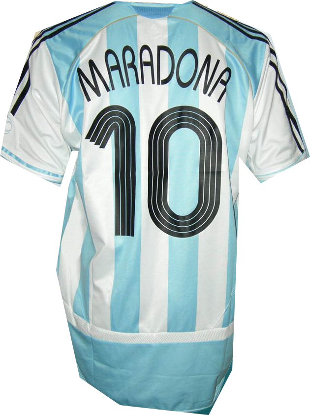
The font uses geometric shapes to produce a robust, clean type face that is easy to read and art deco in feel. Its use shows in industry such as media. Examples of this font family can be seen in the credits of American TV sitcom 'Roseanne'5 and, in recent times, used by Adidas on the back of their sponsored football shirts.
- Bauhaus
wikipedia.org/bauhaus
09:50 04/11/2008 - About the Designer
linotype.com
10:01 04/11/2008 - ITC Bauhaus
myfonts.com
09:42 04/11/2008 - ITC Bauhaus
wikipedia.org/bauhaus_(typeface)
11:18 04/11/2008 - Usages
wikipedia.org/bauhaus_(typeface)#usages
11:55 04/11/2008
- Bauhaus font (Image)
toffsworld.com
13:15 04/11/2008
11 comments:
Hi sam Great description. As a suggestion maybe you could give us a real example on were the font could be used. Like a picture !
Nicely written Sam, an interesting history behind it, you even got Hitler in there!
Thoroughly researched piece which has been well described. I think there is a visual link in the sponsored football shirts.
Hello Sam good description. Im not perfect but shouldnt you have a link for the image you have used?
Hi Sam,
Looks really good mate, the layout, spacing, use of links, its spot on.
Although, as Dominic commented previously, the only thing missing (and I’ve made the same mistake) is an example of the typeface in use.
I believe we’re allowed a little tinker time on this, which would give us the chance to get that sorted.
Regards,
Brad
Hi Sam,
Overall I like the chunking and content of your entry. For me it was very informative and covers all that was asked of you.
However, there are a couple of things I've been able to pick up on;
For me the posted by right at the start distracts but this is personal preference I suppose.
Does German really need a link to a wikipedia entry about Germany, could this not be strengthened more by maybe the CIA factbook or even the German Tourist Board website?
Finally twice you have referred to the font as ICT Bauhaus as oppose to ITC Bauhaus.
Other than that good work Sam
Hey Sam. I found this really easy to read. Tim has picked up on the only error i could see with the ICT being used instead of ITC. All in all a sound piece of work.
Sam
Looking good Sam. Easy Read and look well presentated good work mate.
Hi Sam,
Looks good. Can't really think of anything to improve it. Sorry I can't be more helpful this time round!
Regards, Nick
Hi Sam,
I think everything has been covered really. The only thing I would suggest is a real life example of the typeface. But then I did say everything has been covered (or so I can see)!
Good work.
Hi Sam,
Can't really find fault with your entry other than the Bauhaus Font image won't display on my computer - has this been a common problem?
Some additional images would've finished your piece of nicely.
All in all minor grumbles on an otherwise excellent piece.
All the best,
Ian
Post a Comment